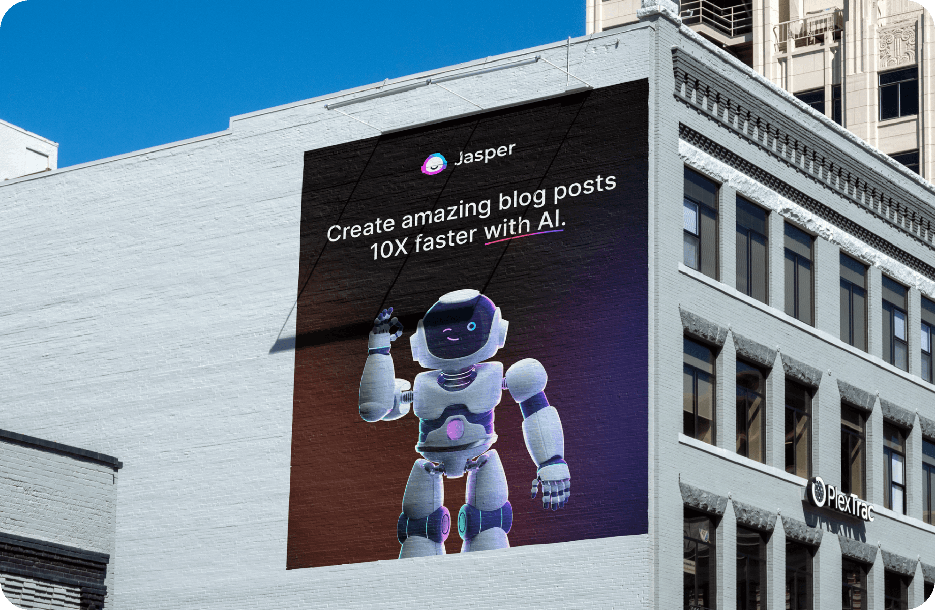
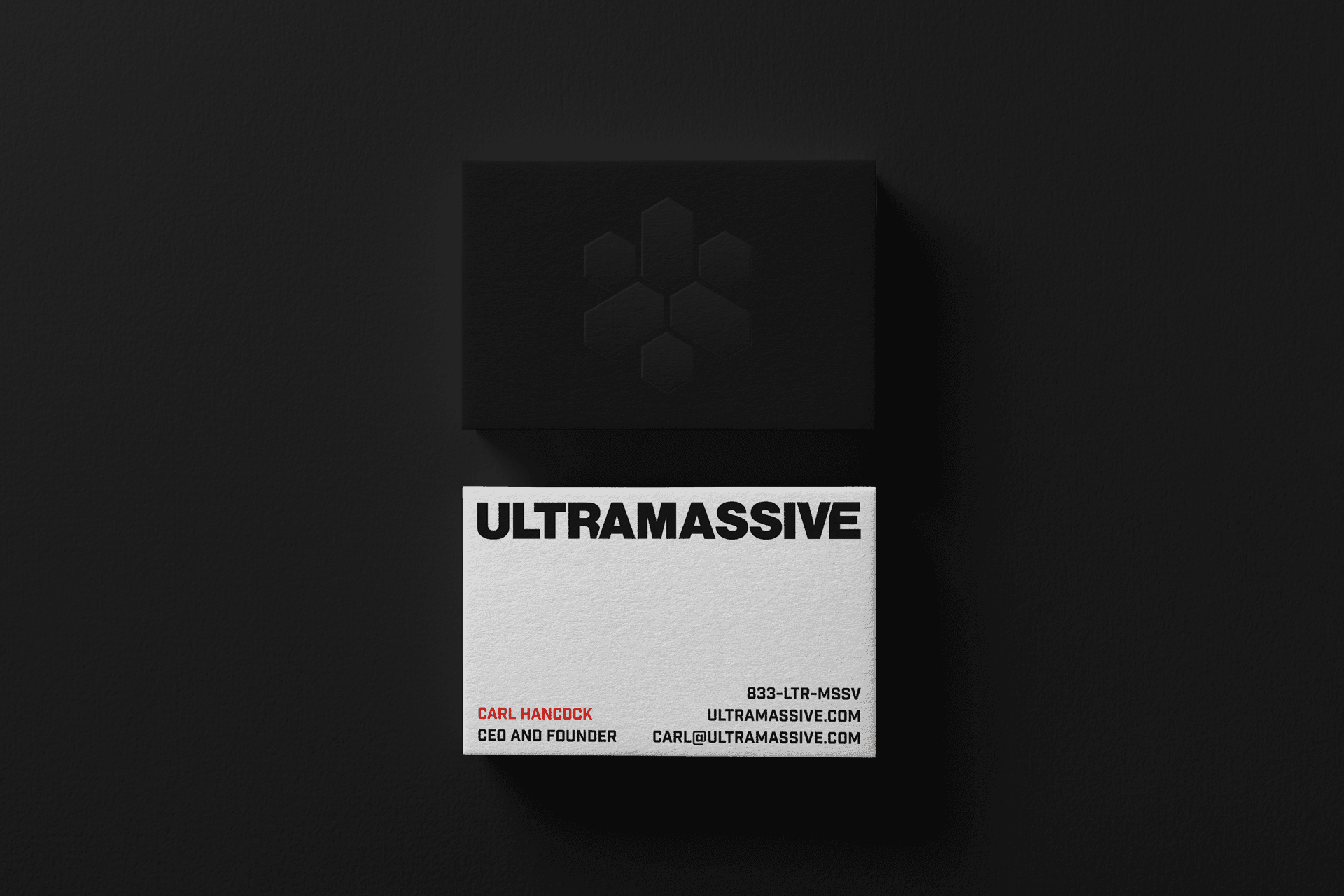
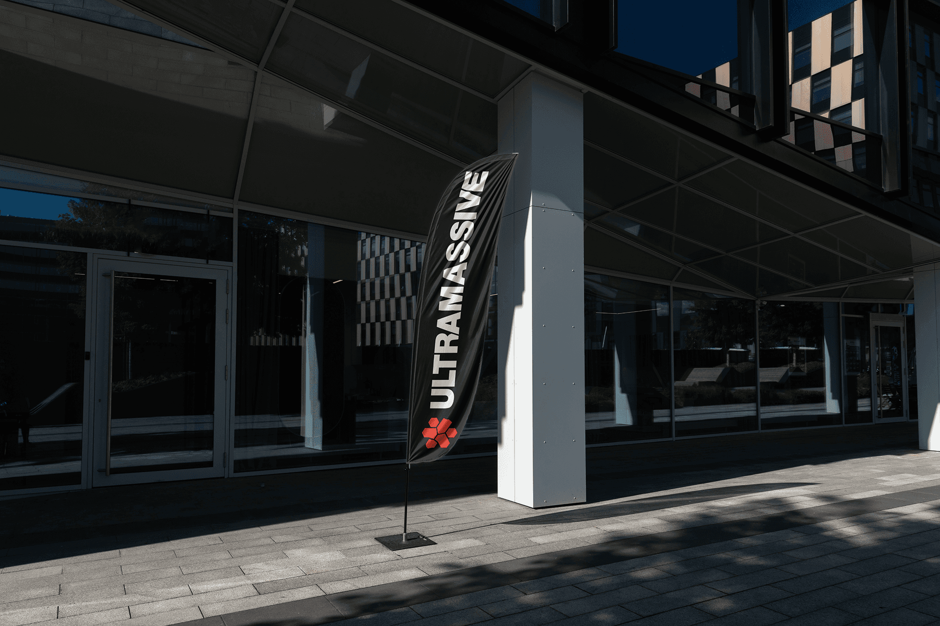
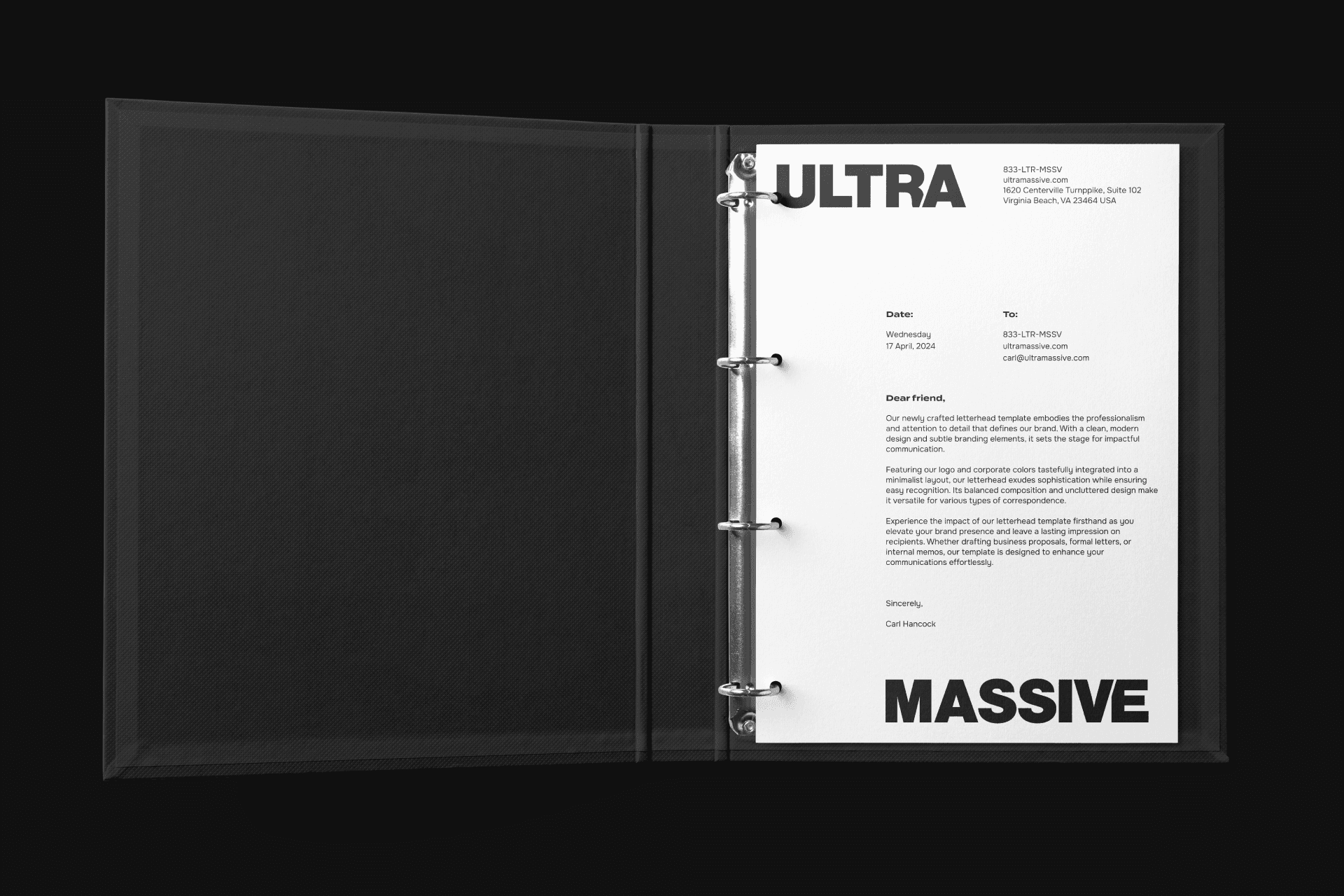
Branding built for founders. Trusted by YC startups.

HockeyStack

,

Visual Identity

,

2024

HockeyStack came to me through Quarter Digital during a period of explosive growth, Y Combinator alumni. The product was mature. The brand wasn't. They needed to stop looking like a scrappy attribution tool and start looking like the Revenue Acceleration Platform they had become — something that could compete with 6sense and Demandbase on any stage. The logo is built around a geometricized hockey stick — a nod to the name, but also to the hockey stick curve that every founder and investor knows: exponential growth. The mark reflects exactly what HockeyStack does: structure complex GTM data into clear, accelerating outcomes.

hockeystack_01

hockeystack_02

hockeystack_03

hockeystack_04

hockeystack_05

hockeystack_06

hockeystack_07

hockeystack_08

hockeystack_09

hockeystack_10

Lumian

,

Visual Identity

,

2026

Lumian was shifting from experimentation to full operational responsibility for Amazon sellers. The brand needed to reflect that — less startup energy, more trusted partner. I built the identity around that idea: human accountability at the core, AI working quietly in the background. The logo centers on a minimalist triangular prism — representing how complex marketplace data gets processed into clear, measurable outcomes. Light became the recurring motif: clarity emerging from complexity. The system extends across dashboards, pitch materials, and digital touchpoints, with subtle motion treatments reinforcing the idea of always-on intelligence. The result positions Lumian as a long-term operating partner — built to scale and built to last.

lumian_01

lumian_02

lumian_03

lumian_04

lumian_05

lumian_06

lumian_07

lumian_08

lumian_09

lumian_10

Jasper

,

Logo Design

,

2021

The team came to me at a turning point. Originally launched as Conversion AI, the product had outgrown its name. As it matured into a full AI assistant, they rebranded — and Jasper was born. I built the identity during this early growth phase, with one goal: create a system that could scale from startup to global brand. The mascot was already part of Jasper's personality. I took its most recognizable element — the head — and made it the core of the logo. Bold, simple, instantly recognizable. I also designed a series of logo animations for YouTube, bringing the brand to life in motion. The result helped carry Jasper from early traction to Times Square — and eventually to unicorn status.

Jasper_01

Jasper_02

Jasper_03

Jasper_04

Jasper_05

Jasper_06

Jasper_07

Jasper_08

Jasper_09

Jasper_10

Ultramassive

,

Visual Identity

,

2024

The founder had a name — strong, protected, full of potential. No product yet, no defined category. Just a vision that needed a visual foundation strong enough to guide whatever came next. The challenge wasn't functional. It was emotional: design something iconic and flexible enough to work for a software platform or a premium physical brand. I drew from the name's cosmic roots — ultramassive black holes — and built a visual system that balances timelessness with presence. The logo works equally well in a software interface or on a physical product. A set of geometric patterns derived from the mark ensures consistency across whatever Ultramassive ultimately becomes.

ultramassive_01

ultramassive_02

ultramassive_03

ultramassive_04

ultramassive_05

ultramassive_06

ultramassive_07

ultramassive_08

ultramassive_09

ultramassive_10

What founders say

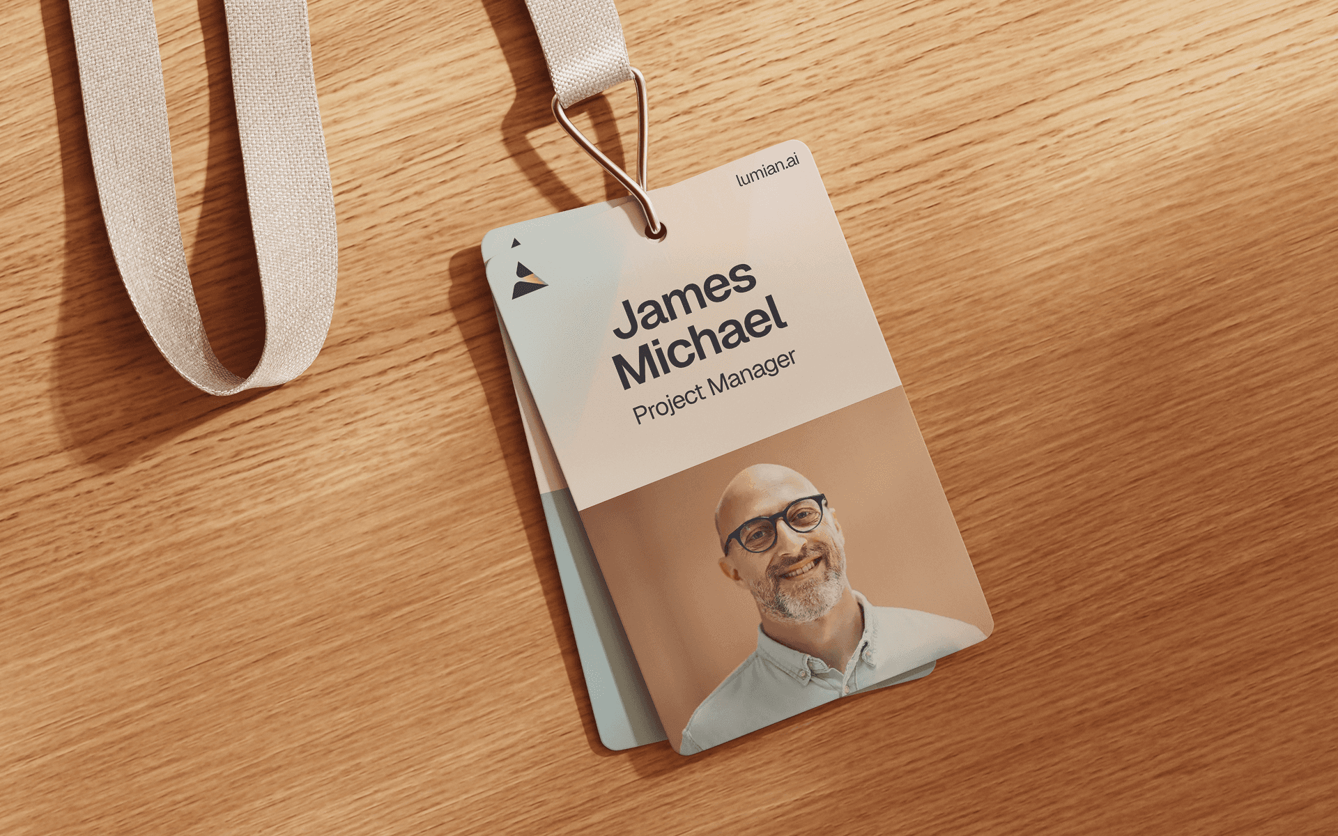
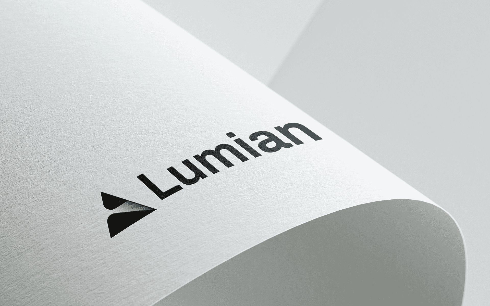
Robin Lobo, Harvard MBA | Serial Entrepreneur

"Oleg built Lumian's original brand identity. He delivered a brand we're genuinely proud of and one that our team could immediately build on. Two things stood out. First, he thinks like a partner. He anticipated what our team would need before we asked for it and kept the project moving without hand-holding. Second, he takes feedback seriously and responds fast. Even after final delivery, he was updating files and refining the system based on our team's input. Would absolutely work with Oleg again and would recommend him to any founder who needs a brand designer that actually gets it done."

Zoe Shykind, Co-Founder at Yuno | Partner in DOGE-1 Lunar Mission w/ SpaceX

"Oleg is an exceptionally talented designer and an absolute pleasure to work with. He supported multiple projects across my companies and has consistently delivered on time, with superb quality, and was communicative throughout the process. He has remarkable attention to detail and possesses a rare ability to translate complex product ideas into clean, high performing designs. If you are looking for a designer for any web platform, software product, or UX-driven build, Oleg is without question my first call."

Nolvia Serrano, CSO at TR Capital. Fintech | Marketing | PR | Events

"We worked with Oleg for the logo and branding design of Ola Real Estate, one of El Salvador’s leading architectural and construction companies developing holiday rental homes. Oleg exceeded our expectations and created a stunning and modern design for our company, he was very professional and pleasant to work with."